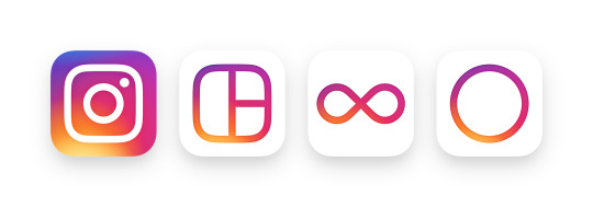
Instagram has created a new app icon and a set of unified icons for Hyperlapse, Layout and Boomerang. Instead of the brown Polaroid-esque square we are used to, the Instagram logo is now bright, colourful and embaces the flat design trend
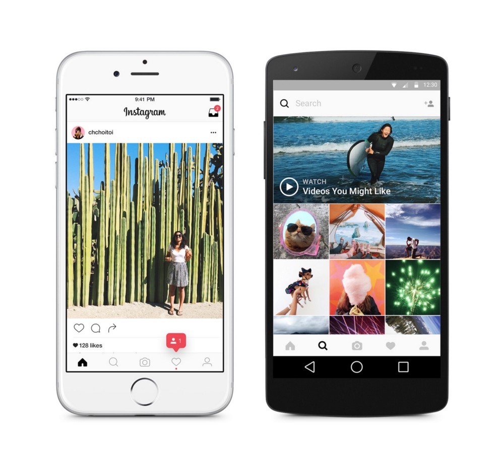
Inside the Instagram app and its Web version, things are the total opposite: There are small UI changes, such as a white top bar and black selected icons instead of blue. The company says they believe the colour should come directly from the community’s photos and videos. The new UI is designed to create something simple and clean so that the users posts are the focus in the app.
The rainbow-themed icons are supposed to represent Instagram’s diverse community, which it says brings all sorts of life and colour to the platform.
“Colour has always been a huge part of Instagram — you see it in the classic app icon, filters, and the community’s photos and videos,” Ian Spalter, Head of Design at Instagram, wrote in a Medium post.
“When we started reimagining the rainbow, we looked at more minimal options, but ultimately we needed more warmth and energy to complement the glyph.”
This is the first logo redesign since Instagram first came out five years ago. The move away from a blue user interface also separates it from its parent company Facebook, which bought Instagram back in 2012 for $1 billion.